Getting Started & New Dashboards
Usability Testing Infura's Developer Dashboard

Overview
Role: UX Researcher
Team: Infura Product, Design, and Engineering
Timeline: April–May 2022
Product: Infura Dashboard (project stats and analytics)
The Problem
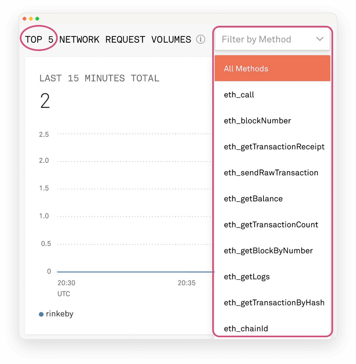
Infura had no clear way for users to learn how to activate their first project and get started. The team designed a new onboarding flow, a "Getting Started" guide walking users through sample API requests, dropdown filters, and chart interactions. Before shipping it, we needed to know whether the flow got people there, or just added more steps to get through.
My Approach
I ran 5 remote, moderated, hour-long usability tests on a high-fidelity prototype, with one open-ended prompt: you want to view all of your project stats, what would you do?
Participants were current Infura customers who varied in project size, frequency of use, and blockchain network
Afterward, a short 5-point survey covered ease, usefulness, and confidence, plus open-ended questions on what they'd change

What We Found
Getting Started worked, but not for everyone. Value tracked closely with role: less experienced users and non-developers weren't sure it was for them, and more experienced developers said it told them nothing and skipped it outright.
There was too much to read. Content was described as verbose and repetitive, and that density likely overshadowed real interactions like Show Me buttons and expandable screenshots, which were easy to miss.
What I Learned
I prioritized recommendations by effort and impact:
Content – Simplify the Getting Started copy
Charts & graphs – Default to bar charts and sharpen time-interval labels
Prototype fidelity – Add more realistic data volume; a thin dataset made it hard for participants to judge the design's real usefulness
What It Mattered
This study shifted our team's conversation from "does onboarding work" to "who is it actually for?" and it informed our feature roadmap and design improvements.